Do you need to create visualizations from your Notion data?
With Notion’s new “charts” feature, it just takes a few clicks to convert your tables into bar charts, line graphs and more.
In this quick tutorial, we’re going to show you how to create a chart in your Notion table and export it as an image file.
Let’s get started!
To begin, open up any page in your Notion workspace.
You can either add charts as a standalone block on a page by typing “/chart”, or by adding your chart as a new view for an existing database.
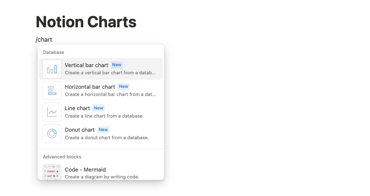
Either way, you’ll see all the same options, and you’ll need to connect your chart to a Notion table as a data source.
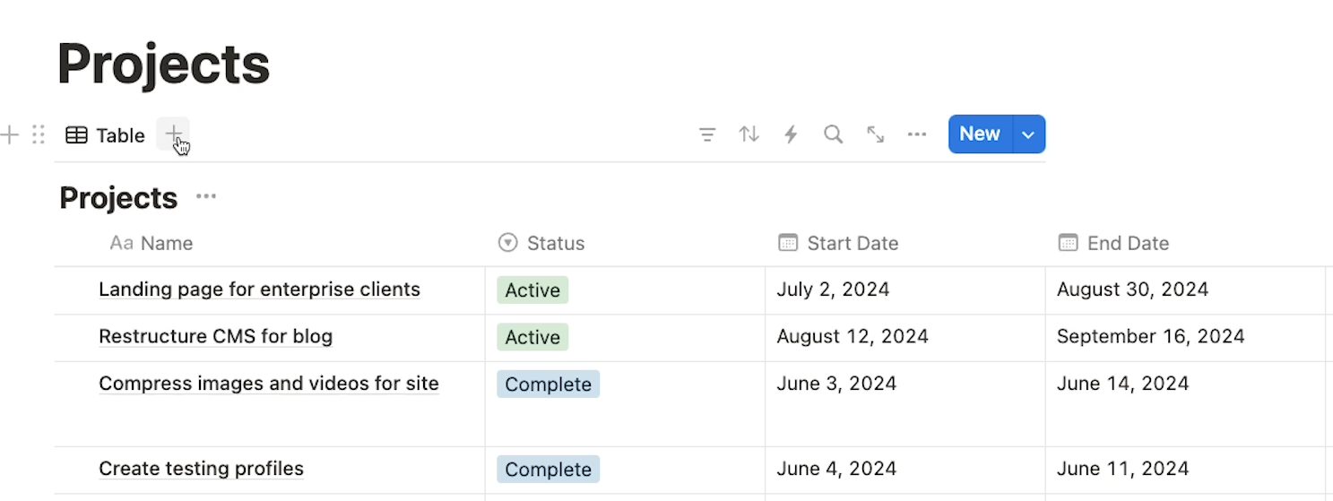
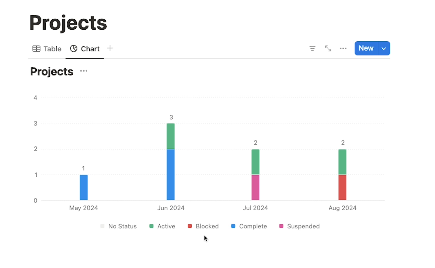
For our example, we’ll add a chart to the “Projects” table pictured below.
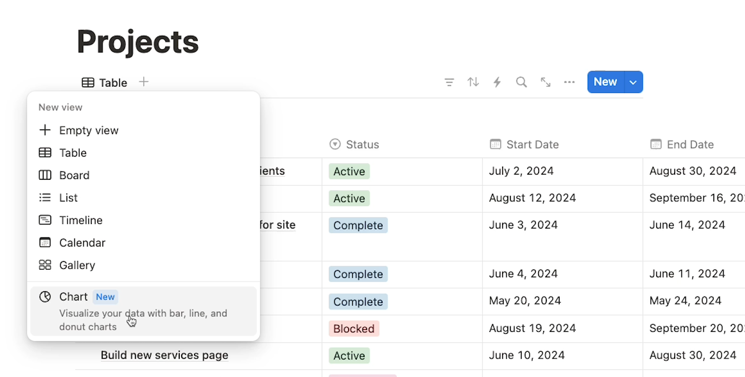
Click on the plus button next to your table’s existing views to create a new view in your table. Then, select “Chart” at the bottom of the list that pops up.
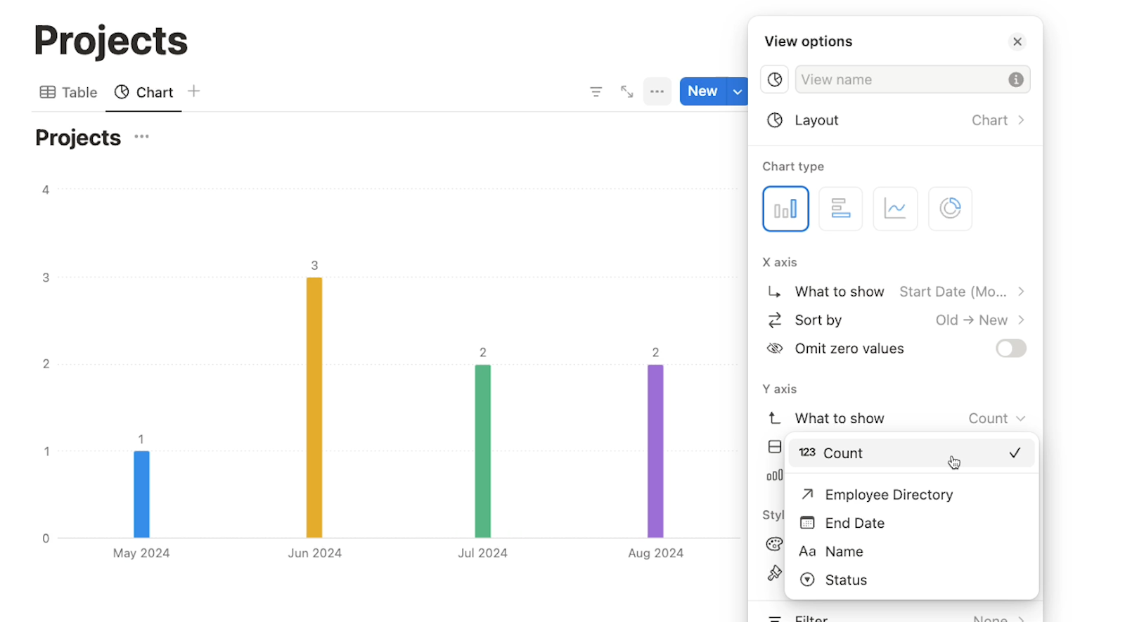
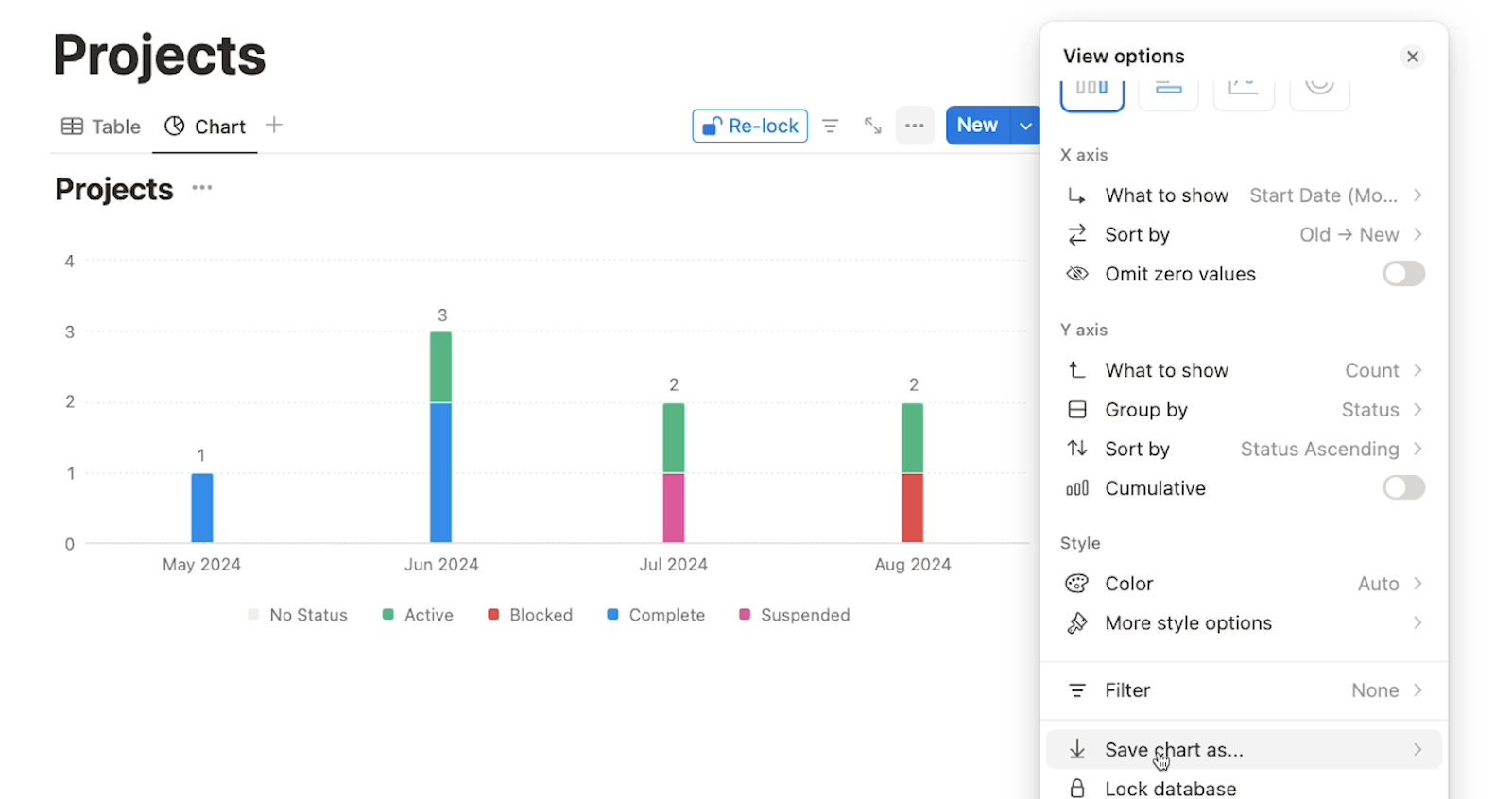
Notion will create a chart out of your table’s data, which you can configure and customize in the “View options” window.
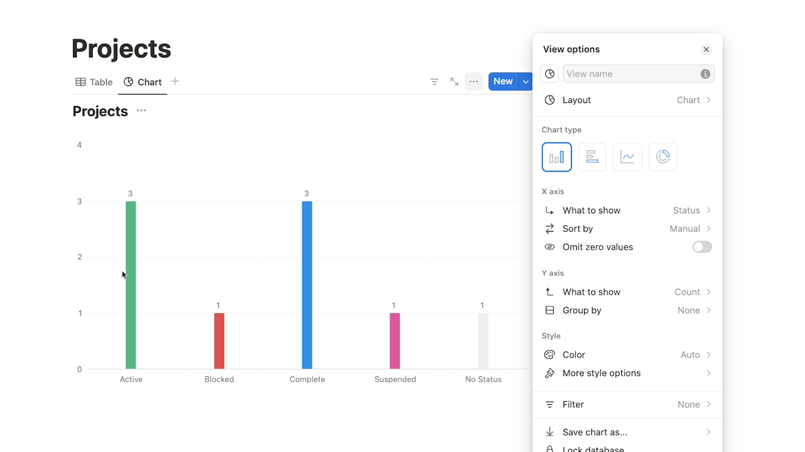
You can set the basic layout as a vertical or horizontal bar chart, a line graph, or a donut chart.
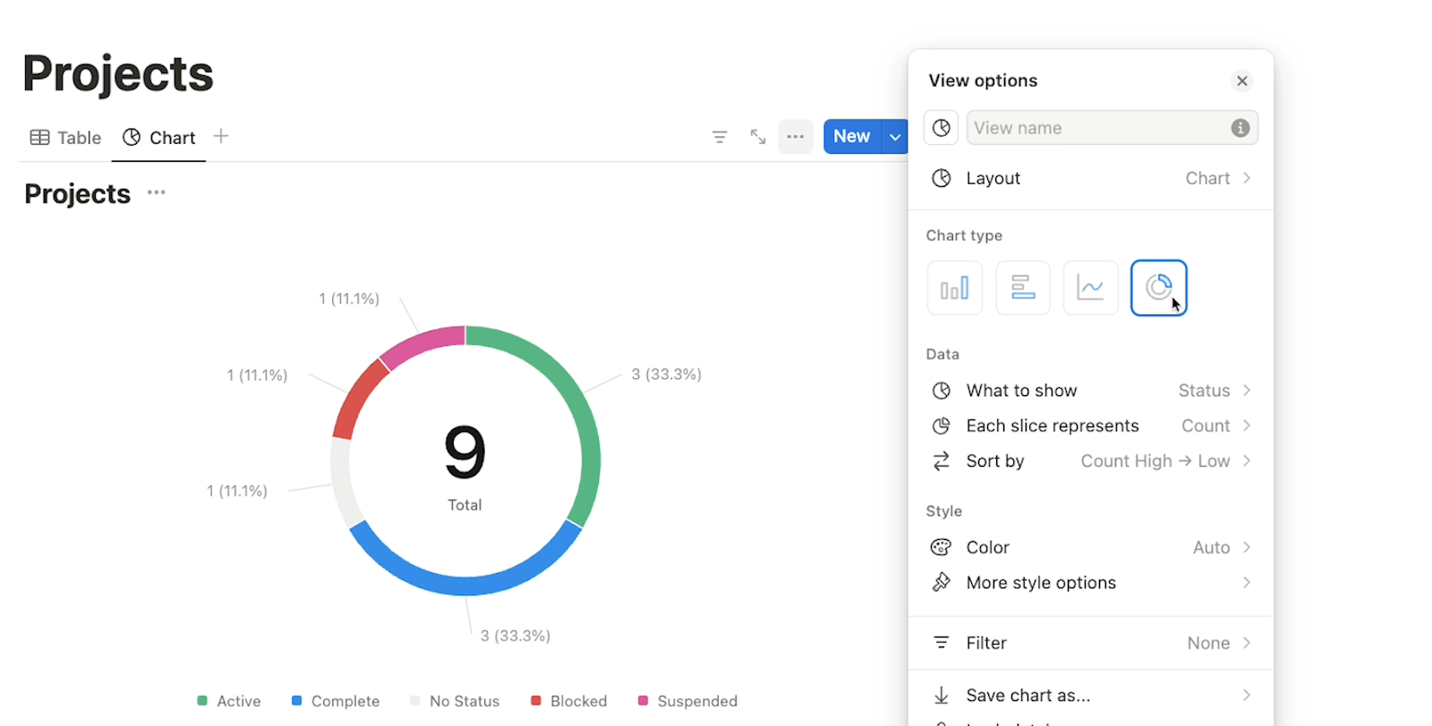
We’ll choose a vertical bar chart.

Next, you can configure the X axis.
Your first choice is to designate which field will be tracked on the X axis. In our example, we’ll choose the “Start date” field.
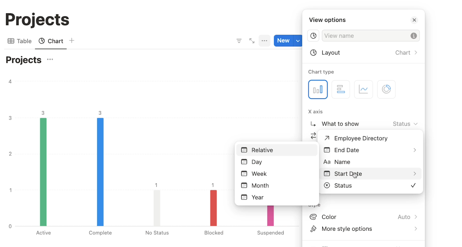
Note that with date fields, you can choose to show the day, week, month or year. You can also choose “Relative” to display the time relative to the current date - for instance, it could show the “last 30 days”.
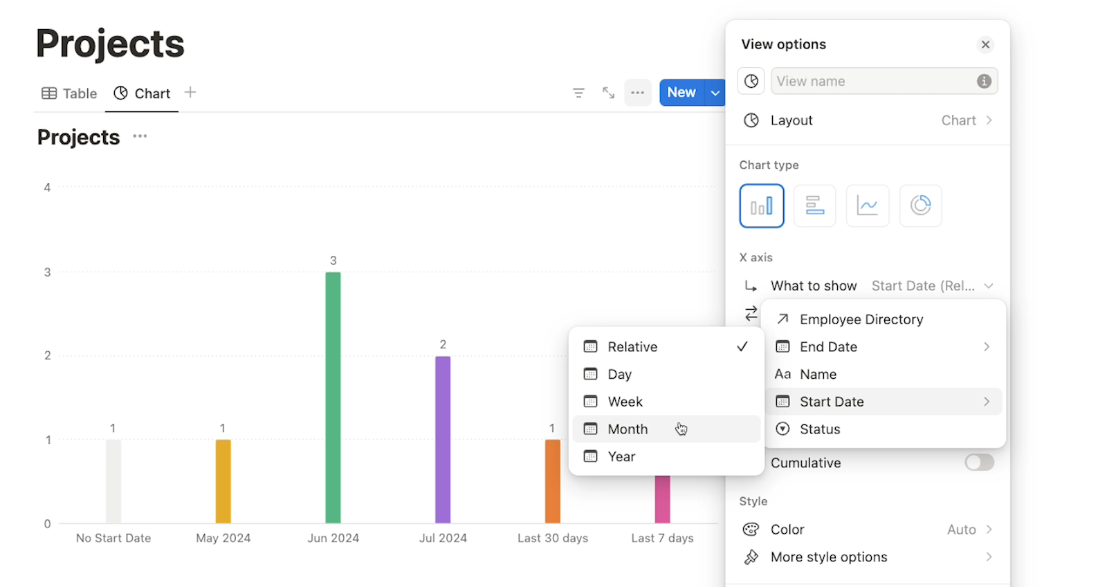
We’ll choose “month”, so we can see the number of projects being started each month.
You can also set a sort order for the X axis, which we’ll leave to the default of “old to new” in our example, and you can choose to “Omit zero values”.
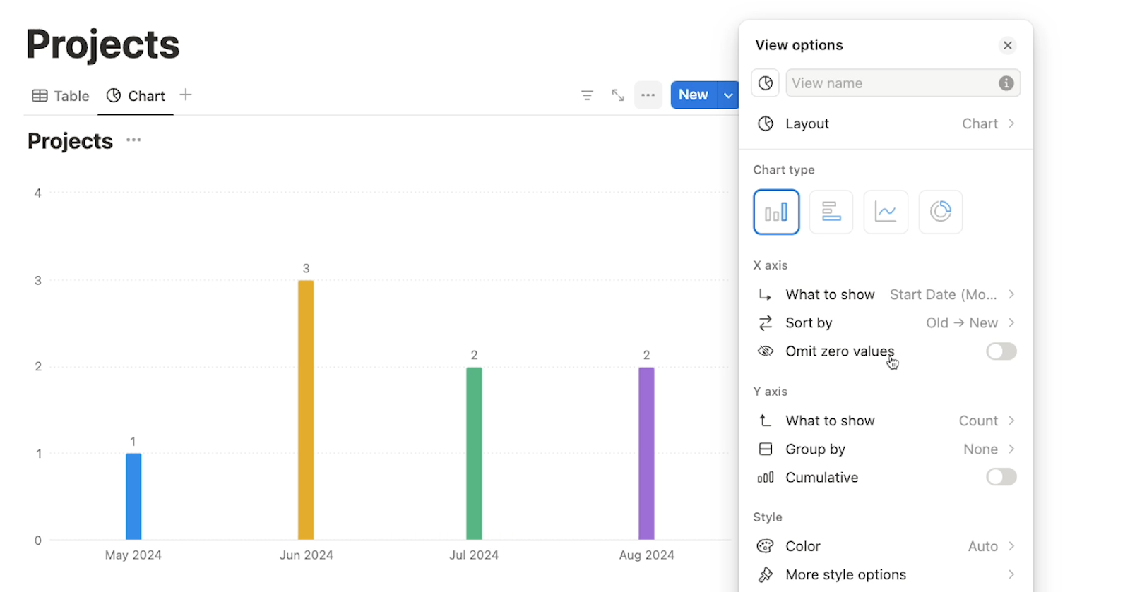
Next, you can configure the Y axis. By default, it’s set to display the “count”, which means it will show how many records exist for each data point shown in the X-axis. In our example, the Y-axis is showing how many projects there are in each month.
However, you can also set your Y-Axis to display any of your other fields, as well.
Next, you can choose to group the Y-axis data by one of the fields in your table. “Grouping” will look a bit different based on which layout you’ve chosen for your chart.
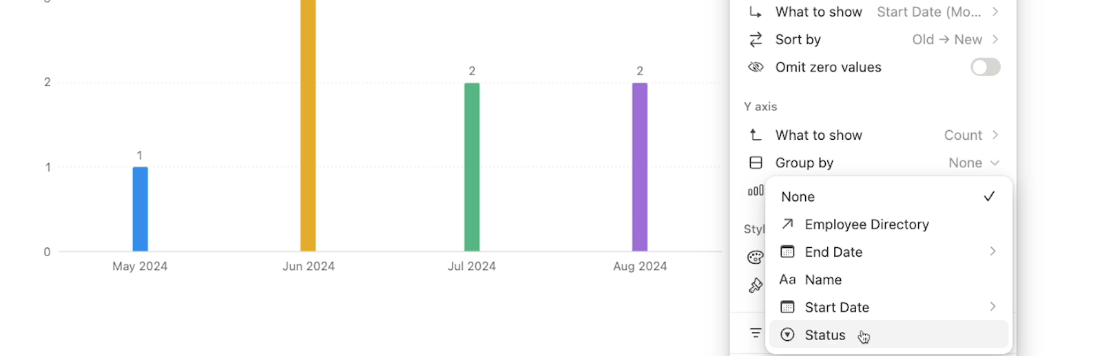
When we map the grouping to our “Status” field, Notion will break up the bars in our graph into multiple colored sections - one for each status option represented in that bar.
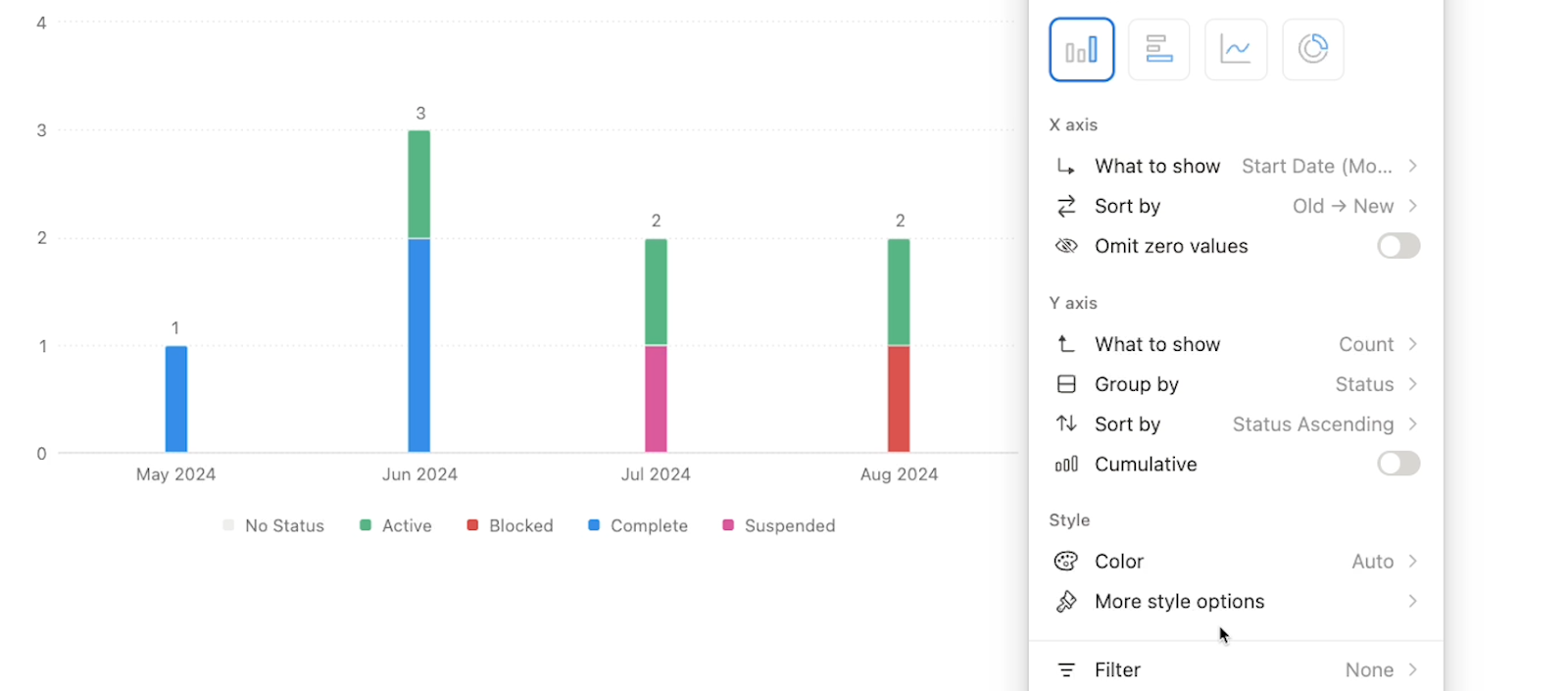
Just like with the X-axis, you can also choose the sort order for the Y-axis.
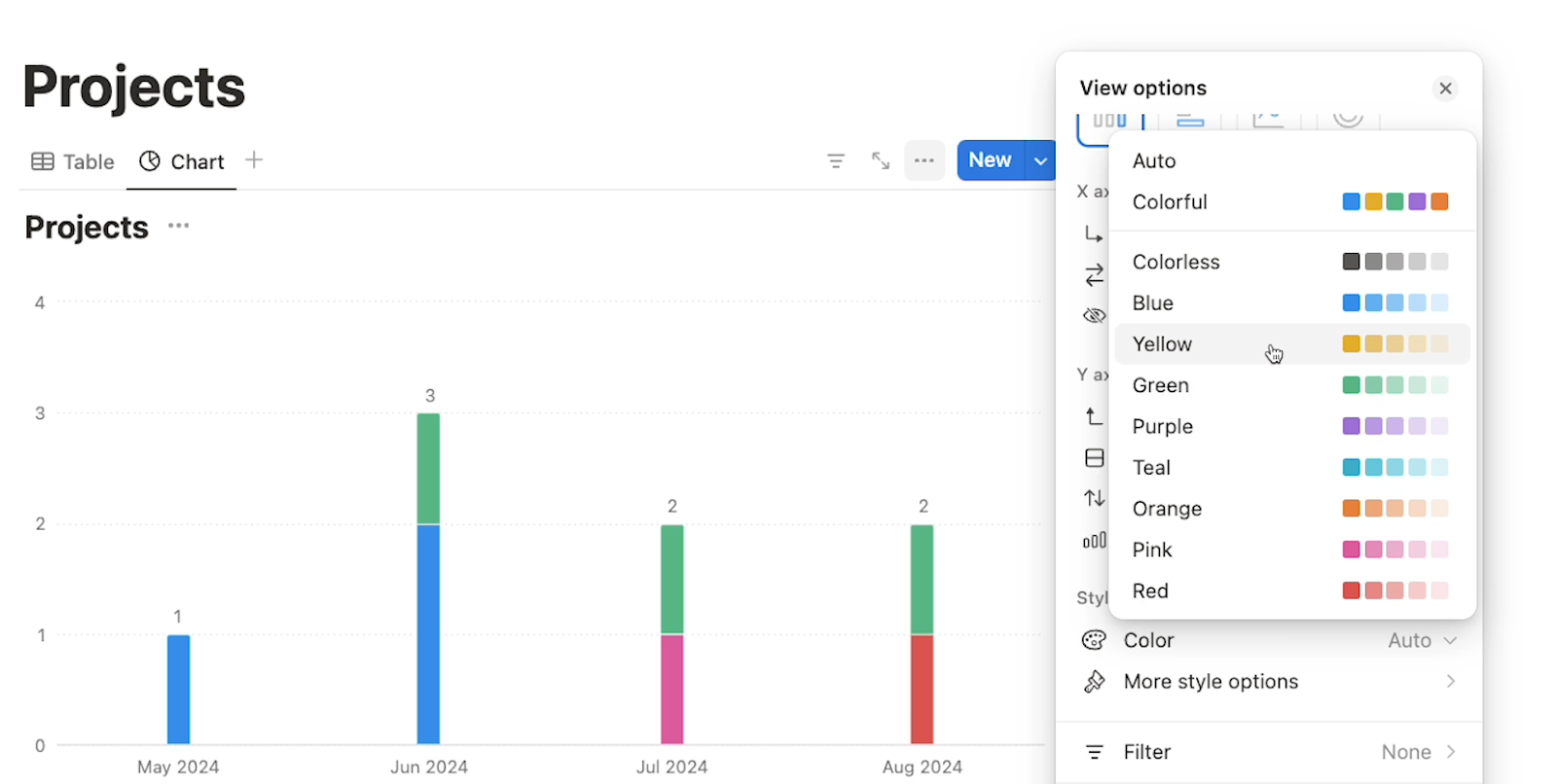
Under “style”, you can set the color scheme for your chart by picking a specific color palette, or just go with the more varied “colorful” option.
You can also choose “Auto”, which will use colors taken from your table when applicable.
Under “more style options”, you’ll see several options to fine-tune your graph’s layout with settings like chart height, grid lines, axis labels, and more.

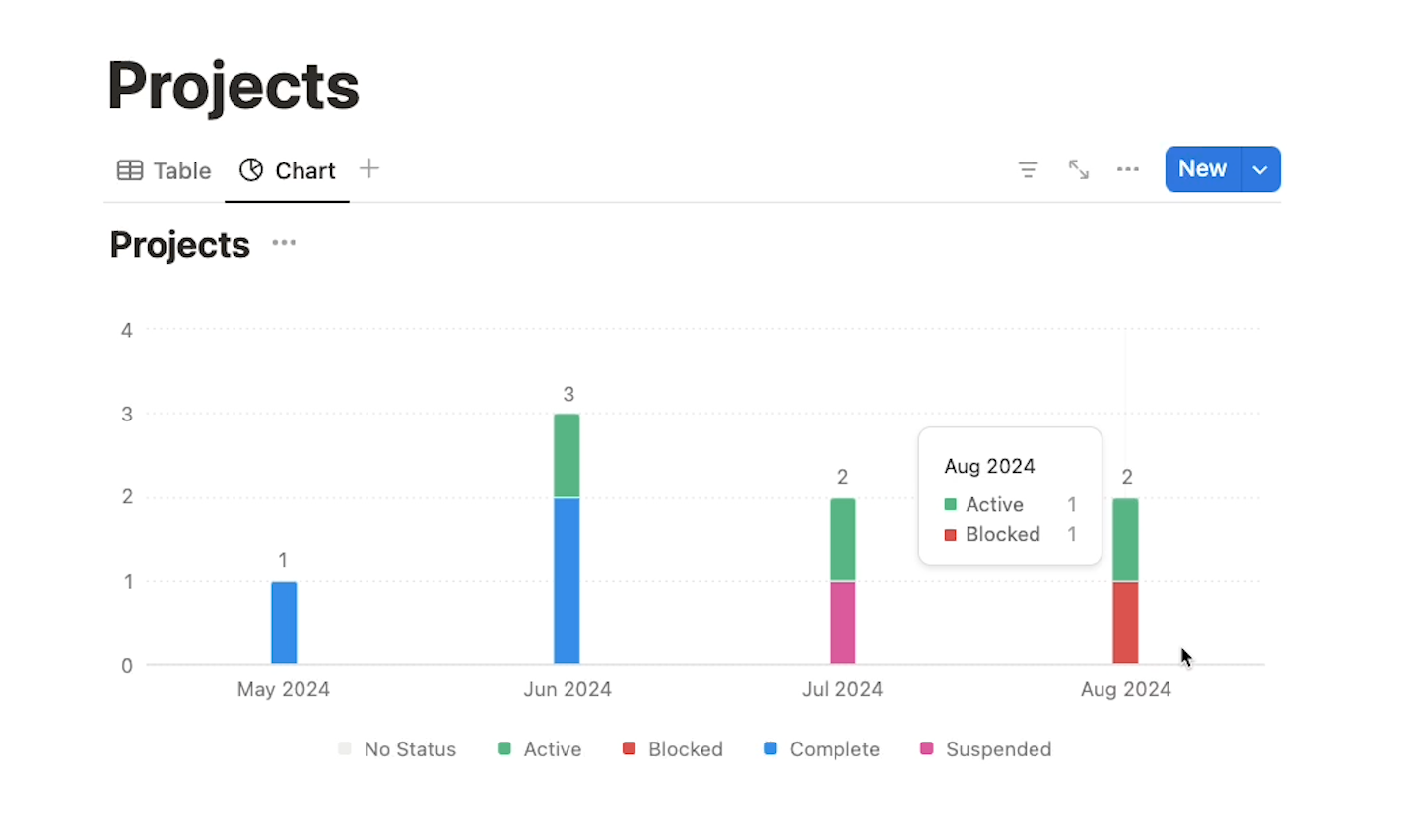
Below, you can see our finished chart after all of our settings have been configured.
There are bars for each month broken up by project status, and when you mouse over the data, some more detail pops up.
If you want to change your Notion chart view’s settings at any time, just click on the three dots menu to access the same options.
You can share your chart like any other page or database in Notion.

However, another simple option that will often work well for collaboration is to export your chart as an image.
To export your Notion chart as a still image, all you have to do is click on the three dot menu, scroll down to “Save chart as”, and select the image format you want to use.
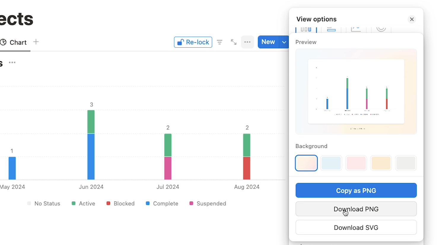
Then, you’ll instantly get an image file of your chart. Below, you can see the exported version of our example “Projects” table.

Of course, you’ll lose some of the detail that you can get by mousing over your live chart in Notion, but this is a great way to quickly export a visualization to add to a report or a website.
Notion charts are currently available to all Notion users. However, users with a free plan are limited to creating just one chart at a time.
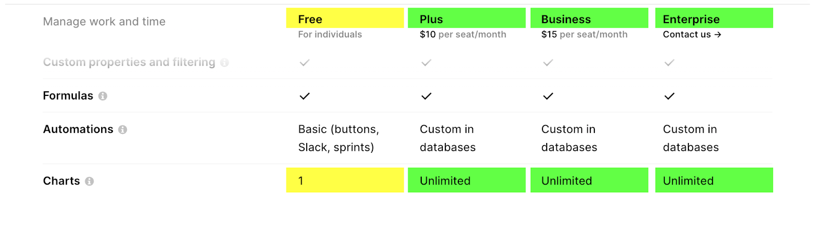
All paid plans include access to unlimited charts, so most Notion power users should be all set to make as many charts as they want.
Notion’s new charts are a simple and effective way to visualize your data, and it only takes a second to export them as an image. Try them out today to start creating useful dashboards and presentations with your data.
If you’d like to learn more about using no-code tools like Notion, Airtable, Zapier, and Make, be sure to check out the other posts on our blog or our YouTube channel. You can also follow XRAY on Twitter, Facebook, or LinkedIn.